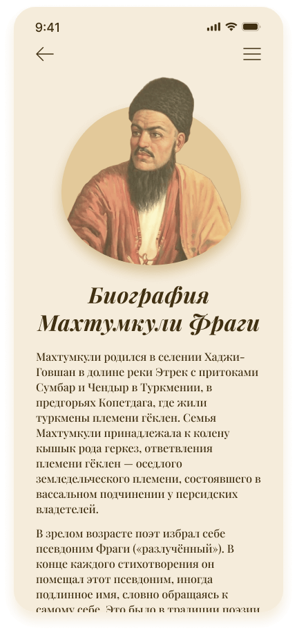
• Magtymguly Poetry App

    Turkmen National Institute of World Languages named after Dovletmamed Azadi has decided to create mobile app devoted to the heritage of National Turkmen poet Magtymguly.

  • App Overview

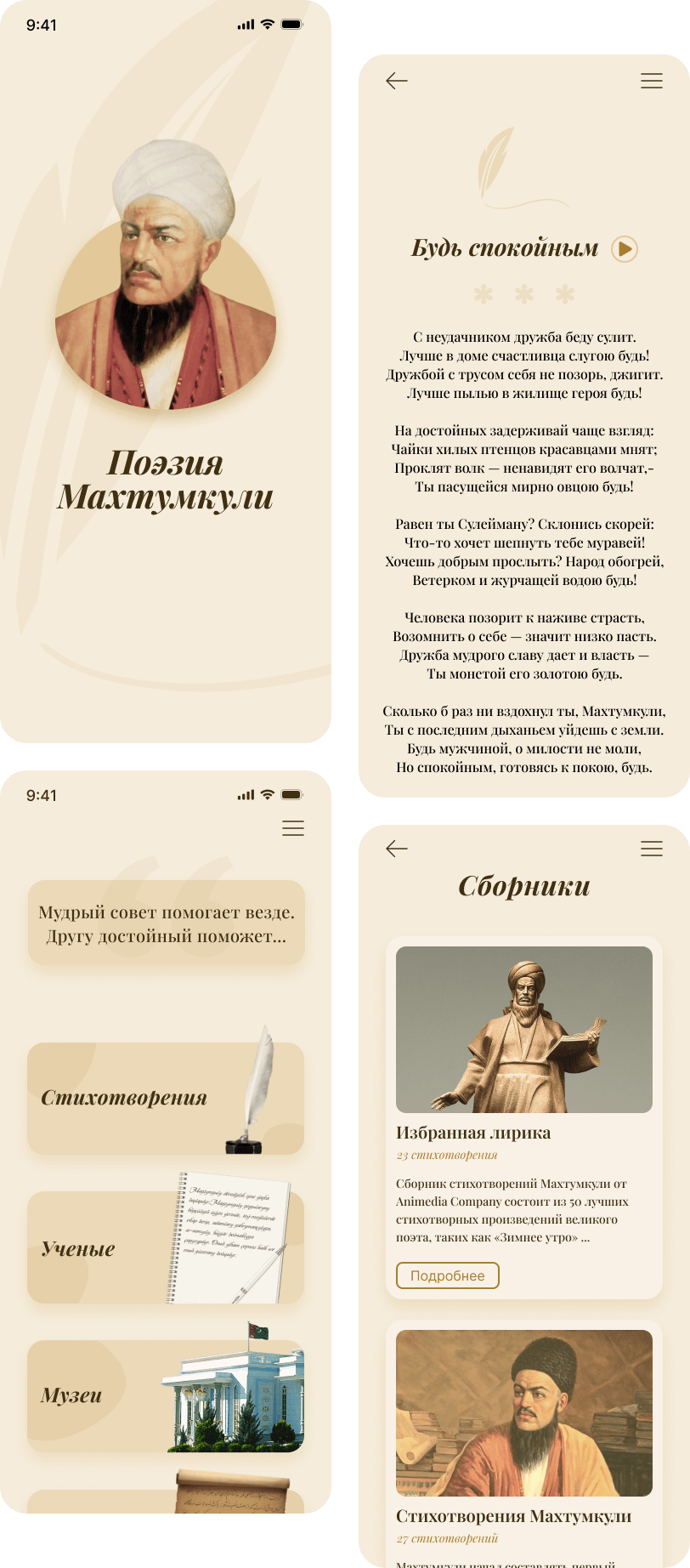
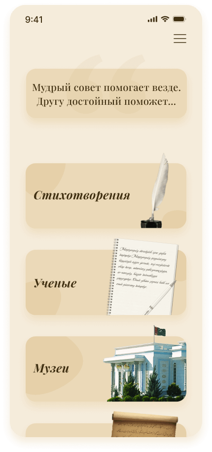
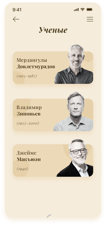
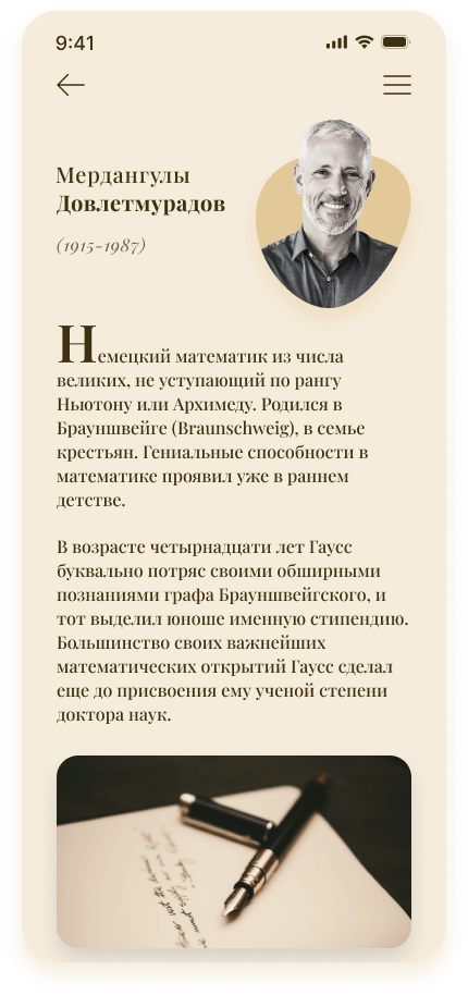
    Magtymguly poetry mobile app is a comprehensive platform that brings together a vast collection of poems, museums, legends, and poem collections of the famous Turkmen poet Magtymguly Pyragy. The app is designed to offer users an immersive experience that not only provides access to the poet's works but also educates them about his life, history, and cultural significance.

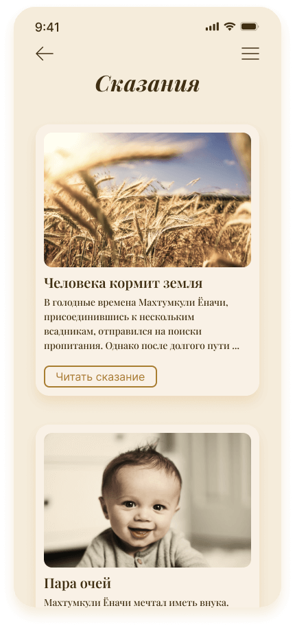
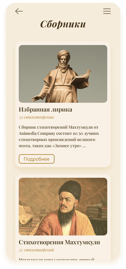
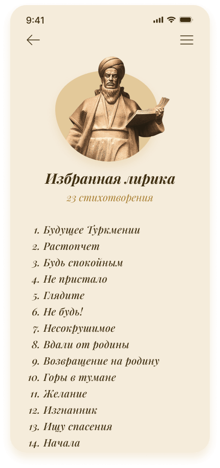
    The app's main feature is its extensive collection of Magtymguly's poems, which are carefully curated and categorized for easy navigation. Users can browse through the poems by title, subject, or collection and explore the poet's writings on a wide range of topics, including love, nature, and spirituality.

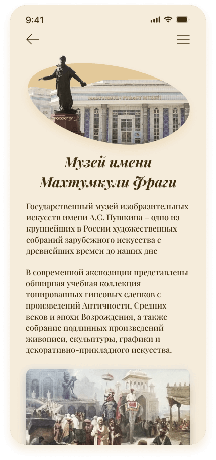
    The app also includes a museum section, which allows users to explore various artifacts, paintings, and photographs related to Magtymguly's life and work. The museums feature a virtual tour of the poet's birthplace and various other locations significant to his life and legacy.

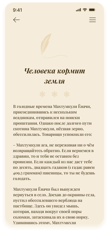
    In addition to the museums, the app features a legends section, where users can learn about the myths and stories surrounding the poet's life. These stories provide a fascinating glimpse into the rich cultural heritage of Turkmenistan, the poet's homeland.

    Magtymguly poetry mobile app is an excellent resource for anyone interested in learning more about the life and work of this legendary poet.
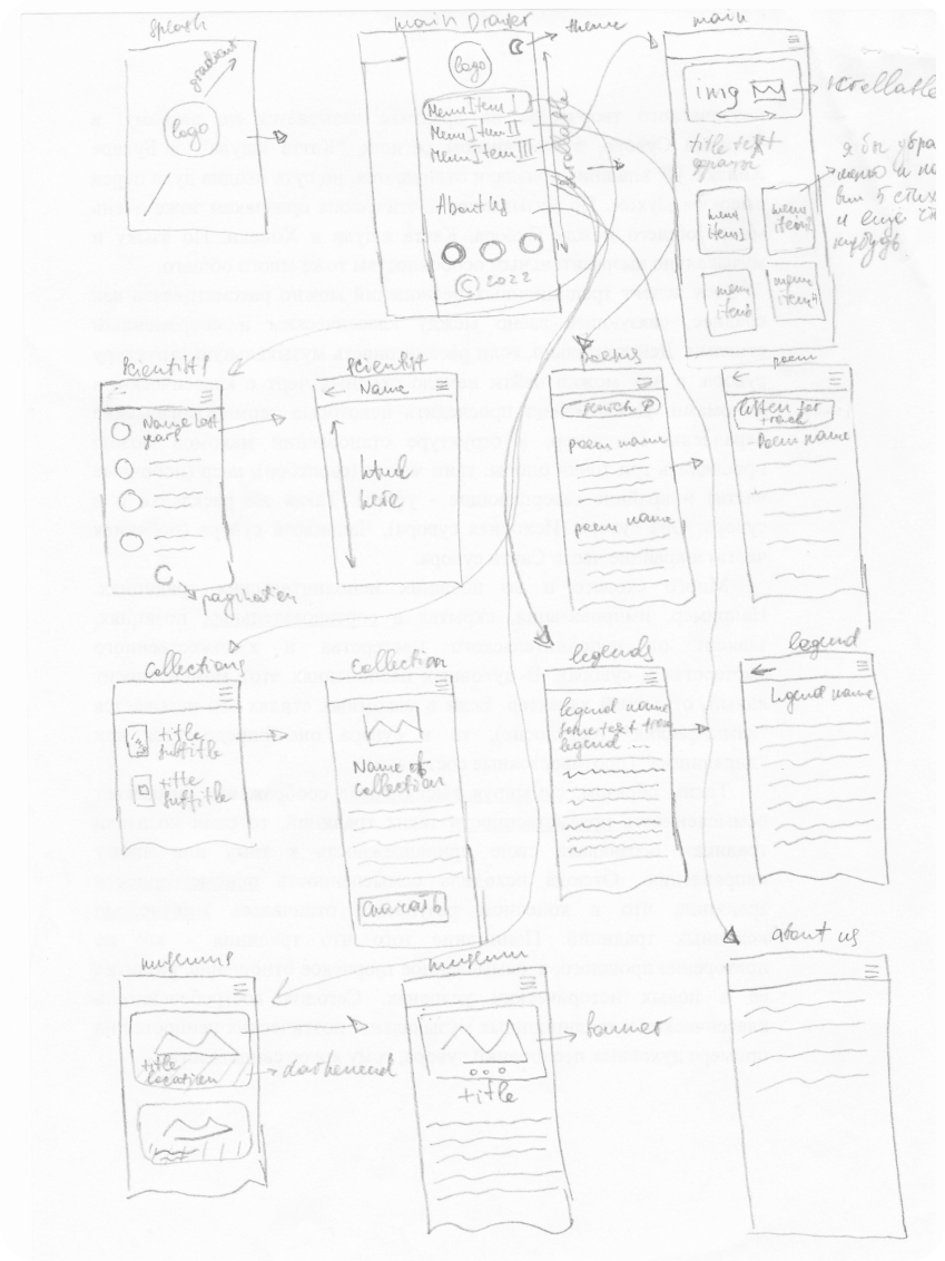
  • Low Fidelity Wireframe

    To begin the design process, the team decided to start with a low-fidelity wireframe. They knew that this would allow them to focus on the basic structure of the app, without getting bogged down in details such as color schemes and typography.

    The team started by sketching out the app on paper, using simple lines and shapes to represent each element. They began with the home screen, which they wanted to be simple and inviting, with an image of Magtymguly and a clear call-to-action to start exploring the poetry.

    They sketched out different layouts for the poem pages, experimenting with font sizes and line spacing to find the optimal reading experience.

    Finally, after several days of sketching and refining, the team had a complete wireframe for the app.

  • Design System | Colors

    For a poetry app, the color palette must be carefully selected to create an atmosphere of warmth, depth, and richness. In this case, a brownish color palette, along with its tints and shades, would be an excellent choice.

    Palette consists of various shades and tints of brown, ranging from light beige to deep chocolate brown.

    These colors resemble old style of poetry. Back then people used to write with goose feathers and ink. And paper color was also a beige tint.

  • Design System | Typography

    How the font was chosen for the project.

    There were several facts to consider.

    First: Magtymguly is a classic of Turkmen literature of the 18th century. A gifted genius, whose work has remained for centuries. Therefore, the font must be classical and evoke an association with literature. Consequently, the font should be serif and have a resemblance to books on classical literature, but at the same time, it should be modern.

    Second: The font should be of high quality, licensed and free.

    Third: The app is in three languages. Which includes Latin alphabet: English and Turkmen and Cyrillic (Russian).

  • Design System | Icons

    I knew that in order to make their app stand out, I needed to pay attention to every detail, including the design of the icons.

    After many brainstorming sessions, I finally settled on a set of icons by Anron Kai. Icons are modern and minimalistic. The set is simple yet elegant, and icons perfectly captured the poetic essence of the app.

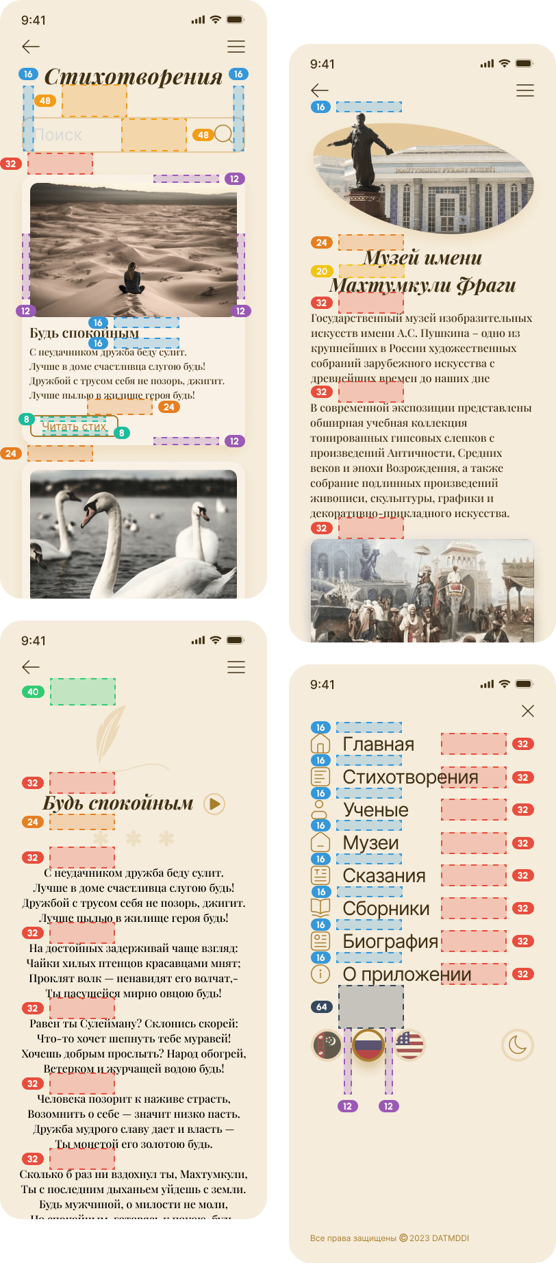
  • Pixel Perfect

    I'm UI Designer and precision is my passion.

    In the digital world, where users are accustomed to interacting with sleek and visually appealing interfaces, pixel-perfect design can make all the difference in attracting and retaining users.

    This level of attention to detail ensures that the design looks clean, professional, and consistent across all devices and screen sizes.

    I used 8 point grid.

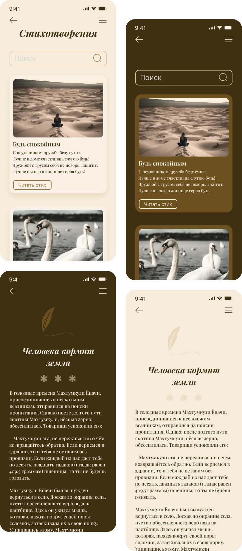
  • Dark Mode 🌑

    Customer wanted to have a Dark Mode functionality in the app.

    My task was to have the same colors in both versions. So, I've done a color palette inversion.

    Customer liked ❤️ it.

  • App Screens